Analyse de marché
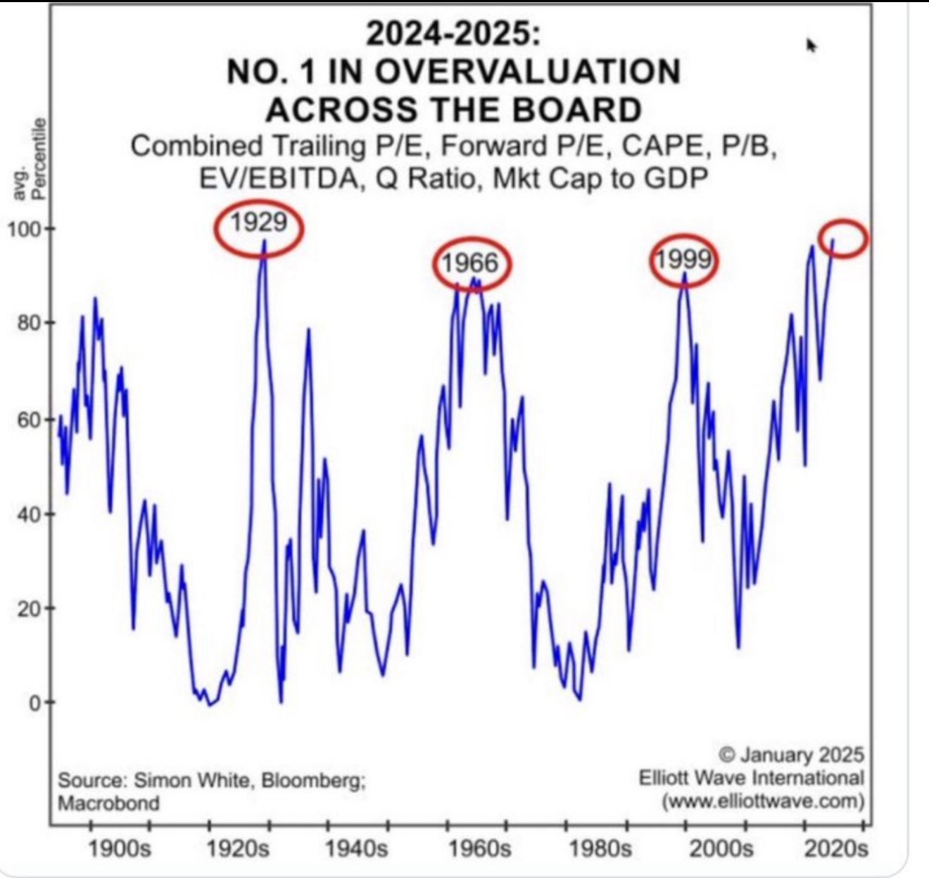
Share This Article
I. MACRO DIAGNOSIS: THE EUPHORIA BUBBLE IS QUANTIFIED
The chart and data confirm that the phrase « this time it’s different » is, as historian Kindleberger documented, the peak signal of a speculative mania.
1. The Shiller Indicator (CAPE): The Sword of Damocles
• The Fact: The CAPE ratio (Cyclically Adjusted Price-to-Earnings Ratio) is at unprecedented levels, exceeding the peaks of 1929 and 1999.
• The CAPE model forecasts annualized returns below 2% for the next decade. This is the ultimate financial argument against Buy-and-Hold investing in the SPX at its current level ($6,840.20 USD).
Upside potential is exhausted; downside risk is maximal.
• Link to Our Analysis: This justifies our anticipation of a complete collapse of the AI Bubble by Autumn 2027, as identified by the historical comparison of SPX cycles.
2. Market Capitalization / GDP (The Buffett Indicator):
• The fact that market capitalization exceeds GDP by 20 to 30% is Warren Buffett‘s favorite indicator for measuring overall market overvaluation. When this indicator is at such an extreme, it means the value of financial assets is completely disconnected from real economic output.
Macro Conclusion: The market is not just overvalued; it is in historical territory of extreme euphoria. The arguments of liquidity (end of QT) and AI capital expenditures are merely excuse narratives maintaining the mania until a liquidity shock (banking risk) or a technical shock (SPX flush) occurs.
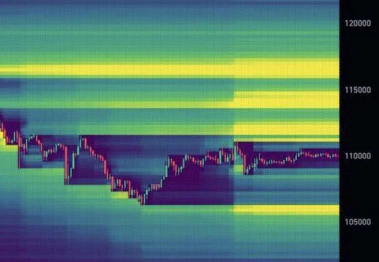
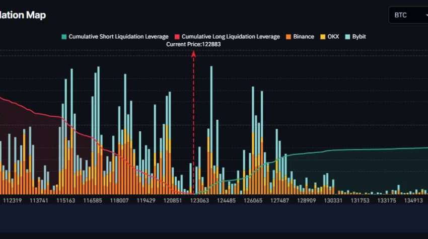
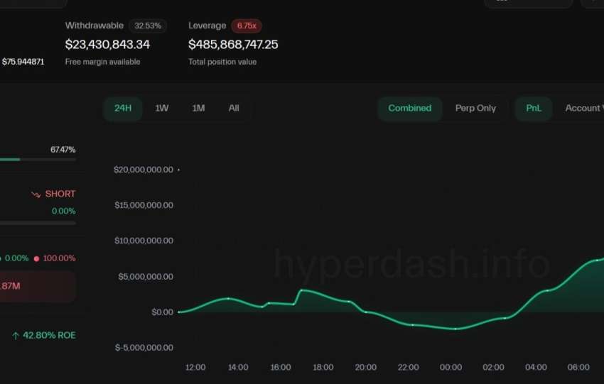
The BTC Movement: The crash risk (signaled by CAPE) is the ideal catalyst to trigger the BTC « Flush » (towards the $107,000-$108,000 USD liquidation zone), offering institutions the last entry point before BTC is propelled by the Short Squeeze towards $120,000+ thanks to the Fed’s liquidity injection.
The signal is clear: the bubble is the largest in modern history. The strategy is to hedge against its bursting while capitalizing on the assets that will benefit from the resulting chaos.